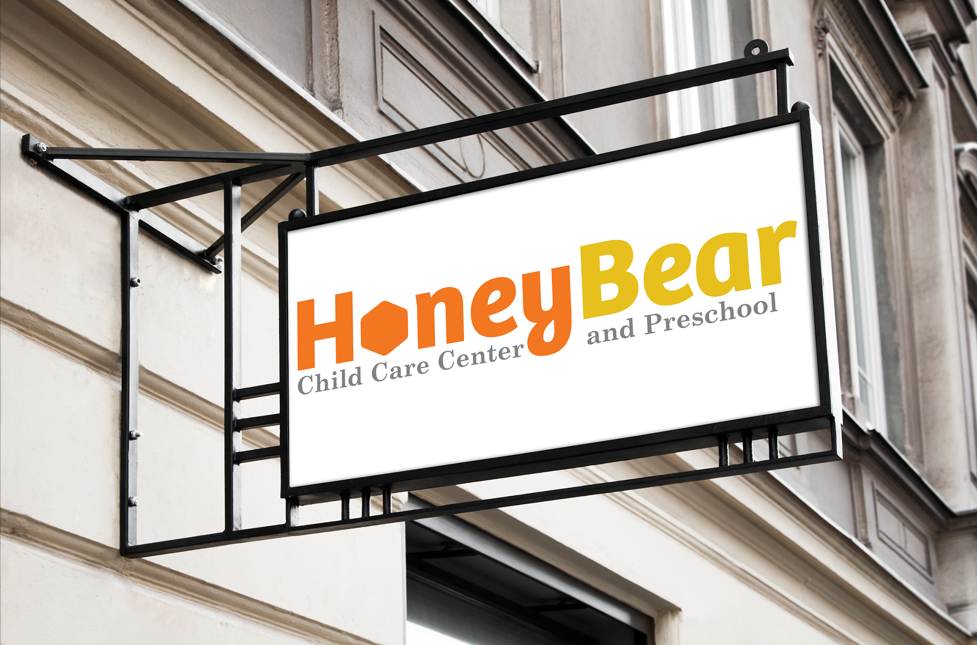
This project was to find a not-so-well-known company and re-do their logo. The company I picked was a daycare named "Honey Bear; Child Care Center and Preschool" in San Diego, California. For me, I thought the original logo had a little too much going on in terms of color and fonts. The characteristics I aimed the re-branding at include:
• combining learning and play
• professional
• providing high quality learning programs for young children and support for their families
Below shows my whole thought process, with the top showing the original logo and then my first idea, second idea, etc. all the way down to the bottom.


My first idea was to attempt to make the B in Bear an actual Bear. This task proved more difficult than I thought and I switched ideas very quickly.


Instead of doing the generic serif, school-ish font, I wanted to go san-serif and professional, but also playful.


Ditching the honeypot idea, I decided to go with a honeycomb replacing the O in honey.

After a review with my class on this last logo, the best course of action, we decided, was to try to fit the child care center and preschool in with the logo, so they become one unit.

The very last revision I had made was to round the edges of the honeycomb, because it was starting to look more corporate-y and less playful.